
This is what we worked on today. We are learning the the eight easy steps of how to draw a skull and how it is easily done. This was my first go at drawing a skull with the eight steps. I think the eight steps are very important as I am really bad at drawing skulls but as soon as I followed the eight step plan it boasted my quality of my drawings.
The Eight Steps of Drawing A Skull -
1) The egg
2) The earhole
3) The axis
4) The sunglasses bone
5) The orbitals
6) The Nasal bone
7) The Jaw
8) The dental arch
WWW - I followed the steps properly and had all the eight steps. My outline and shape of skull was also decent.
EBI - If I had a bit more detail on the inside part of the skull. I should measure the skull next time and try enlarging it next time.

We traced out the skull of a someone in a picture on traceable paper. We used the eight steps we learned before to help us draw the skull of the person in the image. We also drew traced a picture of a skull on traceable paper and used the eight steps to help us well. We than chose one to draw and go over with charcoal.
The Eight Steps of Drawing A Skull -
1) The egg
2) The earhole
3) The axis
4) The sunglasses bone
5) The orbitals
6) The Nasal bone
7) The Jaw
8) The dental arch
WWW - I think I did well on tracing all the details of the picture of the women and I think I got it pretty accurate.
EBI - I think I have to work on the measurements of my drawing as I didn't really get the size right and that effects my drawing majorly.

We start on our main drawing of the skull with charcoal on an A3 paper. I started of with the eight steps to draw the basic structure of the skull. I had a decent outline and structure of the skull so I was ready to do the shading. I started off with a bit of struggle but then Mr. Keys helps me and tells me to just press down on the chalk more so it covers more ground and is brighter or darker and it was very helpful. I didn't manage to finish though.
The Eight Steps of Drawing A Skull - 1) The egg 2) The earhole 3) The axis 4) The sunglasses bone 5) The orbitals 6) The Nasal bone 7) The Jaw 8) The dental arch WWW - The structure of my skull was good because I followed the eight steps which gave me a basic out line of the skull. EBI - I should have gone in a bit more detail before I started shading like fixing up the the jaw and the dental arch. |

I started to do what Mr. Keys tells me to do and I see my drawing is starting to take on a more accurate and realistic drawing. I started to add more details to the shading bits and the little bits of the skull and it looked much better than it did before. I take my time so I don't make mistakes because the other day I rushed through so it wasn't as good as I was hoping. I start to draw the black outside the skull but I ran out of time and the next day I was absent I couldn't come in at break but Mr. Keys said it was okay.
The Eight Steps of Drawing A Skull - 1) The egg 2) The earhole 3) The axis 4) The sunglasses bone 5) The orbitals 6) The Nasal bone 7) The Jaw 8) The dental arch WWW - The shading and minor details were good as I worked at a very slow pace so I can concentrate. EBI - I could have worked a bit faster and worked on my jaw a bit more by fixing its shape. |

I missed out on a lesson about fat muscle. It was basically about putting fat and muscle on the bone. Without the fat and muscle you can't really have a proper self portrait. It was basically combining skull, fat and muscle to make a good and very detailed self portrait.

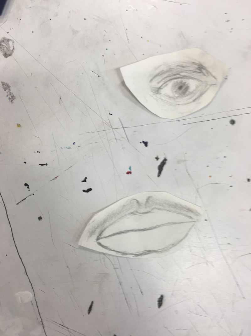
We start to draw the eye, lips and nose. I didn't finish it off but we have time next lesson as well. I start of with the eye. I drew the orbital and drew the shapes I saw in my eyes. I measured with a pencil and my fingers so I got the exact size. I then start the shading so where I see a bit of darkness I shaded it in.
WWW - I think I did well with shadings and I had good measurement of the eyes. EBI - I should have worked on more minor details so it would more accurate and realistic. |

I start to draw the lips and I measure everything with a pencil so it is exact and accurate. My measurements were good but more details would have been better. I didn't have much so it looks a bit rushed and I should have taken a bit more time instead of rushing through my work.
WWW - The measurement was good and accurate. EBI - I should have added more shading and detail to it. |
|
Investigation Task -
Portrait 1 (Looks Like)-
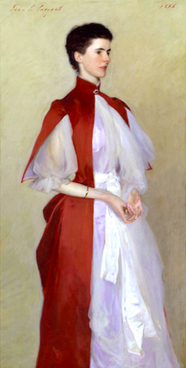
Portrait of Mrs Robert Harrison by John Singer Sargent, 1886 Citation: Tate. (2001, December). 'Portrait of Mrs Robert Harrison', John Singer Sargent, 1886. Retrieved September 13, 2018, from https://www.tate.org.uk/art/artworks/sargent-portrait-of-mrs-robert-harrison-t07693 Introduction -
This is a piece of art by an artist named John Singer Sargent. It was painted in 1886. The name of this portrait is called the Portrait of Mrs. Robert Harrison. This piece of art started when John Singer Sargent returned from a summer in France. This portrait is a combination of the two dominant styles called Realism and Impressionism. This was a style of painting in France at the late nineteenth century. There was a lot of details of that went into this such as the head and hands are very accurate. The colouring is also very precise and realistic. The women in the portrait Mrs Robert Harrison, née Helen Smith came from a wealthy family as she was the daughter of a very rich businessman. Visual -
My reaction to this piece of art was that it looked very realistic and detailed. The technique he used was perfect as you can't tell the artist used a brush. Something else that was very good is the clothing. It gave me decent idea of people used to dress back, well at least the wealthy ones. The colour of the dress, the way it's shaded, it is perfect. I chose this as my Looks like because it is a perfect portrait that tells me about Mrs. Robert Harrison, like how she feels, she looks like a very mature women and how she looks a bit uncomfortable which tells she is a shy and nervous type of women. Artist/Background -
John Singer Sargent was from America. He was called the next best portrait artist by many people. In his his career he drew about 900 oil paintings, more then 2,000 watercolour paintings, as well as a lot sketches and charcoal art. He was able to express realism and impressionism very well throughout his painting as he was into French artwork. The portrait of Mrs. Robert Harrison is an oil painting. This art showed a lot more realism. Realism was a French art technique that began in the 1850s. |

Portrait 2 (Is Like)-
Portrait of Kevin Maybury, by John Minton, 1956 Citation: Tate. (2001, February). 'Portrait of Kevin Maybury', John Minton, 1956. Retrieved September 18, 2018, from https://www.tate.org.uk/art/artworks/minton-portrait-of-kevin-maybury-t05770 Introduction -
This piece of art is called the Portrait of Kevin Maybury and was painted by an artist named John Minton in 1956. Minton has made multiple different drawings of Kevin Maybury but this is his only known one. This painting shows that Maybury is surrounded by tools. The style and few minor details in this painting is also found in a technique of art called Cubism. Most o the shapes here take a square or rectangular shape as you can see in the tools, the floor and Maybury himself. Visual -
My reaction this piece of art makes me think about the colours, shapes and patterns the artist has used. The detail on Maybury has perfect shading for his clothing and hair. What I really liked is how it looks very simple but is a very complex piece of art. This is an oil painting and you can tell but it still looks realistic and accurate at the same time which is very good. Artist/Background -
In the month of April in 1956, John Minton left his Painting School called the Royal College of Art which is based in London, where he had lived since 1948. He lacked confidence and wasn't a very good teacher, he wouldn't be able to teach his students what he knows and how to use it. After he left the college he accepted a job to design stage sets for two productions at The Royal Court Theatre in London called Don Juan and The Death of Satan both written by Ronald Duncan. While Milton was working on set he met an Australian carpenter called Kevin Maybury. They created a trustworthy friendship as they worked together. They had a good friendship which led Milton to draw portraits of Maybury whilst he was working. |

Compare and Contrast -
Composition -
In the Looks like painting of Mrs. Robert Harrison it's a bit hard to tell what is going on in the painting as it is only a paint of her. In most portraits you can tell a lot by just looking at it, even in the ones where it's just them because in other paintings there are more expression but in this she is just holding her hands and almost looking shy and uncomfortable. There is basically no background to this so it allows us to focus more on the expression and emotions she is showing. With the Is like painting of Kevin Maybury, you can tell a lot by the background and expression on his face. He looks very tired because Maybury was a carpenter and had to do a lot of work. I think what makes these two paintings stand out more than the others is that in the Portrait of Mrs. Robert Harrison, she is the main aspect of the painting but in the portrait of Kevin Maybury shows a lot more so there isn't much of a main aspect in the painting because both Maybury and his background say a lot about him.
Colour -
In the portrait of Mrs. Harrison, There isn't a colour that really stands out except for the red but the way it is shown it doesn't really catch my eyes. The rest of the painting is of normal and simple colours like white, pale, etc. like the colour of her dress and the colour of her skin. Minton's portrait though had a use of different colours which stand against one another. It is more eye catchy and a bit more lively.

Mood -
The mood for Mrs. Robert Harrison portrait has a more emotional touch then anything else. It feels as she is uncomfortable and nervous. She feels a bit shy which is shown in the portrait. In Minton's painting he shows the Maybury is tired and exhausted which can also mean he is boring. Even though the background is very colourful and lively his emotions and expression is still the same as he looks like he has come from a long day of work.
Surface/Texture -
The Mrs. Harrison portrait looks like it is very smooth and soft because usually women clothing is very unique as they soft and smooth. It feels as if it is very silky as well and it goes in a very relaxing flow. Minton's painting has a bit more of roughness as there is tools everywhere and it doesn't feel very smooth. It feels like it's in a small place with many tools which looks very messy making us feel like it is very hard and rough.

We are drawing a mans portrait throughout his life. He has three portrait of him before the war, during the war and after the war. I chose the portrait of him in the war. We cut the portrait in half we use one side to compare the colours and then the other one we draw the other side of the portrait. This is what I have done so far.
WWW - I think I had a good outline of the portrait and good details so far for the portrait. I had a good idea of what I was gonna do.
EBI - I didn't have the exact colour I wanted so it didn't look exactly as I wanted to. I should have a better mixture of colours.
WWW - I think I had a good outline of the portrait and good details so far for the portrait. I had a good idea of what I was gonna do.
EBI - I didn't have the exact colour I wanted so it didn't look exactly as I wanted to. I should have a better mixture of colours.

Today we went around giving each other comments on our abstract portraits. My comments are pretty accurate as who I chose is a very messy person he has a lot of mood swings.
WWW - People knew what type of person I was doing so that means I used the messiness decently.
EBI - I could have used more shapes and tones so it looked better instead of just looking like bunch of scribbled lines with different colours.
WWW - People knew what type of person I was doing so that means I used the messiness decently.
EBI - I could have used more shapes and tones so it looked better instead of just looking like bunch of scribbled lines with different colours.
This year we have done a lot of things so far. We have improved our thinking skills by breaking things down. We analyze the drawing then we break it down in steps so it makes our drawing better and easier. My social skills have improved as our website is basically a social website as people can go through it and we can go through other peoples. My communication skills have improved as we worked with different people in different groups. We used it by talking and sharing our ideas. My self management skills have improved as I worked by myself and I have done well so far. My research skill has improved as I gt an eight for my investigation task.

We are pointing out the types of techniques this artist used and how it made the art piece a lot better than it would have been.
